

Why Responsive Web Design Matters for Automotive Dealers
- Feb 19
- 9 min read

Every dealer knows the frustration when potential customers abandon a website because it simply does not work well on a mobile phone. For UK-based automotive dealerships, this problem often means missed leads and lost sales opportunities. With responsive web design, your site can intelligently reshape itself for any device, creating consistently smooth experiences and increasing the likelihood of customer engagement. Understanding the fundamentals of responsive web solutions puts you in control of creating digital showrooms that captivate visitors and maximise every enquiry.
Table of Contents
Key Takeaways
Point | Details |
Responsive Web Design is Essential | Automotive dealerships must implement responsive web design to enhance customer engagement across multiple devices. |
Key Technical Components | Employ fluid grids, flexible images, and CSS media queries to ensure optimal functionality and appearance on any device. |
Impact on Lead Generation | Responsive design simplifies user interactions, resulting in higher conversion rates and improved customer contact opportunities. |
Cost Efficiency | Maintaining a unified codebase through responsive design reduces development costs while improving search engine visibility. |
What Is Responsive Web Design for Automotive?
Responsive web design represents a critical digital strategy for automotive dealerships seeking to engage customers across multiple devices. At its core, responsive design enables websites to automatically adapt and reshape their layout and content based on the specific screen size and device being used, ensuring a seamless user experience whether customers are browsing on desktop computers, tablets, or smartphones.
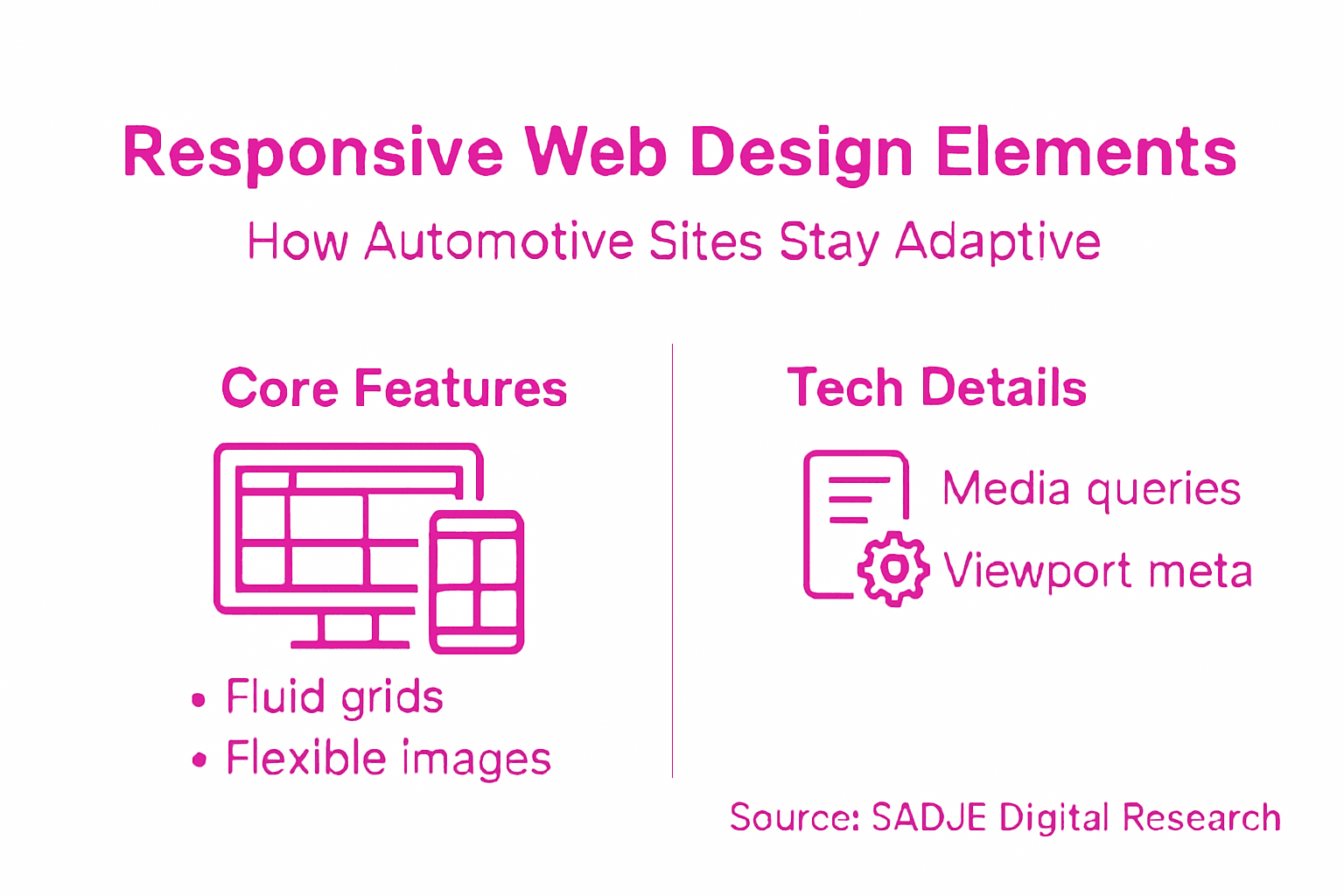
The fundamental principles of responsive web design involve three key technical approaches:
Fluid Grid Layouts: Designing webpage elements using percentage-based measurements instead of fixed pixel widths
Flexible Image Scaling: Ensuring images resize proportionally without losing quality or breaking page design
CSS Media Queries: Implementing conditional styling rules that trigger different layout configurations based on screen dimensions
These techniques allow automotive dealer websites to create adaptive digital experiences that dynamically adjust content presentation. For instance, a complex desktop showroom display might transform into a streamlined, vertically-stacked mobile interface that prioritises critical information like vehicle pricing, contact details, and booking options.
Technically, responsive design operates through intelligent CSS and HTML frameworks that enable websites to detect device characteristics in real-time. This means the same website can provide an optimised viewing experience across smartphones, tablets, laptops, and desktop monitors without requiring separate design versions.
Pro tip: Test your automotive website’s responsiveness using free online tools like Google’s Mobile-Friendly Test to identify potential design improvement areas.
Key Elements That Power Responsive Sites
Responsive web design for automotive websites relies on sophisticated technical components that enable seamless digital experiences across multiple devices. Flexible layout technologies form the foundational framework that allows dealership websites to adapt dynamically to various screen sizes and user interfaces.
The core elements powering responsive automotive websites include:
Viewport Meta Tag: Controls how web pages scale and render on mobile devices
CSS Media Queries: Enables conditional styling based on device characteristics
Fluid Grid Systems: Allows content to resize proportionally across different screens
Flexible Image Techniques: Ensures visual elements scale without losing quality
Mobile-First Design Philosophy: Prioritises mobile user experience during initial development
These technical approaches work together to create a unified browsing experience. Modern automotive websites must consider that potential customers might research vehicles using smartphones, tablets, or desktop computers, requiring a consistently professional presentation across all platforms.
Technical implementation involves using advanced CSS frameworks like Flexbox and CSS Grid, which provide robust tools for creating adaptive layouts. These technologies enable automotive dealers to design websites that automatically reconfigure navigation menus, image galleries, and booking interfaces to match the specific device’s screen dimensions and capabilities.
Responsive design is not just about visual scaling, but creating an intuitive user experience that feels native to each device type.
Pro tip: Regularly test your automotive website on multiple devices and screen sizes to ensure consistent performance and user experience.
Types of Responsive Solutions and Alternatives
Web design strategies for automotive websites offer multiple approaches to creating multi-device compatible digital experiences. While responsive design remains the most versatile solution, dealers now have several strategic options to consider when developing their online presence.
The primary approaches to multi-device web design include:
Responsive Design: Single website that dynamically adapts to all screen sizes
Adaptive Design: Multiple fixed layouts triggered by specific device characteristics
Mobile-Specific Websites: Completely separate mobile versions of desktop sites
Progressive Web Apps (PWAs): Advanced web applications with native app-like experiences
Framework-Based Solutions: Utilising pre-built responsive frameworks like Bootstrap
Responsive design typically offers the most comprehensive solution for automotive dealerships. This approach ensures a consistent brand experience across devices, reduces development complexity, and provides superior search engine optimisation compared to alternative methods. Adaptive and mobile-specific designs, while once popular, often require more maintenance and can fragment the user experience.
Modern automotive websites increasingly leverage hybrid approaches that combine responsive design principles with advanced interactive technologies. These solutions allow dealerships to create sophisticated online experiences that seamlessly transition between desktop, tablet, and mobile platforms, ensuring potential customers can easily browse vehicle inventories, schedule test drives, and access critical information regardless of their device.
Here’s a comparison of popular automotive web design approaches and their typical use cases:
Approach | Typical Use Case | Maintenance Level |
Responsive Design | Most dealerships, unified brand | Low |
Adaptive Design | Legacy systems, fixed layouts | Moderate |
Mobile-Specific Sites | Separate mobile experiences | High |
Progressive Web Apps | App-like functionality needed | Moderate |
Not all responsive solutions are created equal - the key is finding an approach that balances technical sophistication with user-friendly design.
Pro tip: Select a web design approach that minimises maintenance overhead while maximising cross-device compatibility and user engagement.
How Responsive Design Drives Lead Generation
Responsive web design strategies play a critical role in transforming automotive dealership websites from static digital brochures into powerful lead generation platforms. By creating seamless user experiences across devices, responsive design directly impacts how potential customers interact with and engage with automotive sales websites.
Key lead generation mechanisms enabled by responsive design include:
Simplified Inquiry Forms: Easy-to-complete forms on any device
Click-to-Call Functionality: Immediate connection options for mobile users
Optimised Call-to-Action (CTA) Buttons: Large, tappable interface elements
Fast Load Times: Reduced bounce rates across different devices
Consistent Brand Experience: Unified messaging regardless of screen size
The technical architecture of responsive design ensures that potential car buyers experience minimal friction when exploring vehicle inventories, scheduling test drives, or requesting quotations. This reduction in digital barriers directly translates to higher conversion rates, as users can effortlessly navigate websites using smartphones, tablets, or desktop computers.

From a search engine perspective, responsive design provides additional lead generation advantages by improving organic visibility. Google’s mobile-first indexing prioritises websites that deliver consistent, high-quality experiences across all platforms, effectively rewarding automotive dealers who invest in sophisticated, adaptable web technologies.
The following table highlights how responsive design enhances lead generation for automotive websites:
Lead Generation Feature | Business Benefit |
Click-to-call integration | Faster customer contact |
Optimised CTAs | Higher enquiry rates |
Streamlined forms | Less drop-off in lead submission |
Fast page loading | Reduced bounce rates, more engagement |
Responsive design isn’t just about looking good - it’s about creating frictionless pathways to customer engagement.
Pro tip: Regularly analyse your website’s mobile performance metrics to continuously optimise lead generation potential across different devices.
SEO, ROI, and Cost Efficiency Benefits
Responsive web design benefits extend far beyond visual appeal, presenting automotive dealerships with a strategic digital investment that dramatically improves online performance and operational efficiency. By consolidating web development efforts into a single, adaptable platform, dealerships can simultaneously enhance their search engine visibility, reduce maintenance costs, and increase potential customer engagement.
The primary financial and operational advantages include:
Unified Codebase: Reduces development and maintenance expenses
Enhanced Search Rankings: Improved visibility through mobile-first indexing
Lower Technical Overhead: Single website instead of multiple platform versions
Consistent User Experience: Reduces customer friction across devices
Improved Conversion Rates: More accessible and user-friendly interfaces
From an search engine optimisation perspective, responsive design signals to Google’s algorithms that a website provides high-quality, consistent user experiences. This alignment with search engine preferences directly translates into improved organic search rankings, potentially increasing website traffic without additional advertising expenditure. The cost-efficiency becomes particularly pronounced when considering the alternative of maintaining separate desktop and mobile websites.
Moreover, the return on investment (ROI) for responsive design extends beyond immediate technical benefits. By creating a seamless digital experience, automotive dealers can reduce bounce rates, increase time spent on site, and ultimately drive more qualified leads through improved user interaction and accessibility.
Responsive design is not an expense, but a strategic investment in digital customer engagement.
Pro tip: Conduct quarterly performance audits of your website’s responsiveness to continually optimise user experience and search engine performance.
Common Pitfalls in Automotive Web Development
Web development challenges can significantly undermine automotive dealership websites, potentially costing valuable leads and damaging online reputation. Understanding these critical pitfalls is essential for creating digital platforms that effectively convert website visitors into potential customers.
The most prevalent technical issues in automotive web development include:
Inadequate Mobile Responsiveness: Websites that fail to adapt across different devices
Slow Page Load Times: Performance issues that increase visitor bounce rates
Complex Navigation Structures: Confusing menus that frustrate potential buyers
Poor Image Optimisation: Unscaled or poorly compressed visual content
Limited Accessibility Features: Websites inaccessible to users with disabilities
Technical performance remains a critical factor in user engagement. Automotive dealership websites must prioritise seamless user experiences across smartphones, tablets, and desktop computers. Slow-loading pages or poorly structured interfaces can instantly discourage potential customers, causing them to abandon their research and explore competitor websites.
Moreover, search engine algorithms increasingly penalise websites with poor performance and limited mobile compatibility. This means that technical shortcomings not only impact immediate user experience but can also significantly reduce organic search visibility, further limiting potential customer acquisition.
A poorly designed website is more than an inconvenience - it’s a missed opportunity for customer engagement.
Pro tip: Implement comprehensive cross-device testing protocols to identify and resolve potential user experience barriers before launching your automotive website.
Unlock the Full Potential of Responsive Web Design for Your Automotive Business
Responsive web design is essential for automotive dealers seeking to deliver a seamless and engaging experience across all devices. If your website struggles with slow load times, inconsistent layouts, or confusing navigation on mobiles and tablets, you risk losing valuable leads and damaging your online reputation. By prioritising fluid layouts, optimised call-to-action elements, and fast mobile performance, you can increase customer engagement and conversions.
At SADJE, we specialise in developing bespoke automotive websites that harness the full power of responsive web technologies. From integrating innovative lead-generation tools like 3D configurators and instant quote systems to implementing SEO strategies that boost your local search visibility, our tailored solutions help you connect with more car buyers and service customers effortlessly.
Explore our expert automotive web design services to future-proof your digital presence today.
Don’t let a poorly optimised website stifle your dealership’s growth. Partner with SADJE now to create a fast, user-friendly, and lead-generating online platform that adapts flawlessly to every screen. Visit SADJE to start transforming your automotive business with cutting-edge responsive design solutions.
Frequently Asked Questions
What is responsive web design in the context of automotive websites?
Responsive web design is a digital strategy that allows automotive dealership websites to automatically adapt their layout and content based on the screen size and device being used, ensuring a seamless user experience across desktops, tablets, and smartphones.
How does responsive web design improve lead generation for automotive dealers?
Responsive web design enhances lead generation by providing simplified inquiry forms, click-to-call functionality for mobile users, optimised call-to-action buttons, faster load times, and a consistent brand experience, all of which increase customer engagement and conversion rates.
What are the key elements that power responsive web design for automotive websites?
Key elements of responsive web design include viewport meta tags, CSS media queries, fluid grid systems, flexible image techniques, and a mobile-first design philosophy, which work together to ensure a unified browsing experience across various devices.
How does responsive design impact search engine optimisation (SEO) for automotive dealerships?
Responsive design improves SEO by offering a single, adaptive website that meets Google’s mobile-first indexing requirements. This leads to better search rankings and visibility, as search engines prioritise websites that provide high-quality, consistent user experiences across all platforms.
Recommended
Great interview, but if I'm being honest felt more like 'why I'm still a Calvinist' than 'Christian'. I respect that Kristen's faith tradition is important to her, and she can obviously share to the level she feels comfortable with and no more, but this was a very intellectual conversation. deep chemical peel newcastle 'd Motorcycle Pants have appreciated hearing more about Kristen's personal faith in Jesus Himself and why that is not shaken despite the attacks she's endured.
I read the article about the weekend weather for October 20th on ODG, and it gives a good sense of autumn conditions in the Lake District. While it looks like it will be a bit cooler and cloudier, there’s still a chance for drier periods — perfect for walks and outdoor activities if the weather avoids heavy rain or storms. The article notes that it may be possible to avoid the worst effects of storms and enjoy the weekend mostly without serious weather problems,Best magnesium cream for restless legs elevations could be windy and chilly. This is useful information for anyone planning trips, hikes, or outdoor time, as warm clothing and waterproof shoes will be helpful, but in some areas…
I read your post about the treatment of hyperhidrosis and it helped explain why some people sweat more than usual and how it can affect daily life in simple terms. Last semester when I was almost done with a big law essay I felt overwhelmed and had to winning training boxing gloves late at night because orologi da parete moderni I needed fresh eyes on my formatting and grammar. shoyoroll Gi It made me realize asking for help can really lift a weight off your shoulders.
Great interview, but if I'm being honest felt more like 'why I'm still a Calvinist' than 'Christian'. I respect that Kristen's faith tradition is important to her, and she can obviously share to the level she feels comfortable with and no more, but this was a very intellectual conversation. russian lip filler 'd have appreciated hearing more about Kristen's personal faith in Jesus Himself and why that is not shaken despite the attacks she's endured.
This was a very thoughtful and engaging post. I really enjoyed how the author described everyday experiences with such clarity and reflection. It reminds readers that even simple moments can carry meaningful lessons. As a student, I often read blogs like this during study breaks to refresh my mind. Sometimes while managing deadlines, I also explore options to find the best assignment help website that can guide me through difficult topics. Posts like this not only inspire reflection but also encourage students to stay focused, balanced, and motivated in their learning journey.